Typical (Neural-Network-Based) Classification vs. Zero-Shot, Part 1 - The Joy of 3D
Visualizations in 3 (and 4) dimensions


- Intro
- Viz Matters
- Dimensions and Embeddings
- Showing (3D) 3-Class Classification in 2D
- How Traditional NN Classification Training Proceeds
- Loss vs. Accuracy
- Metric-Based Embedding Methods
- How well do they work?
- Summary
- Acknowledgements:
- References:
(This blog post is an extended treatment of a talk I recently gave. To see the slides for the talk, click here.)
Intro
We're going to explore the difference between what I term "traditional" machine learning (ML) classification and so-called "zero-shot" classifiers that rely on embedding semantically meaningful features as clusters in space by means of contrastive losses. These "zero-shot" on "contrastive loss" methods are increasingly prevalent in the ML literature, and have the nice property that, unlike traditional ML classifiers, they don't need to be re-trained whenever new classes are introduced. If we want to understand these embedding-based zero-shot methods, it will be helpful to consider traditional classification as an embedding method of it own.
There is also a strong pedagogical point that I wish to make in this post. Often in teaching ML, many authors will spend some time on binary classification via logistic regression (see my post "Naughty by Numbers: Classifications at Christmas") and then jump immediately into multi-class classification where the number of classes is 10, or 1000, or 1000 and up. There is an opportunity that is being passed over. The opportunity is visualization, and what is being passed over is the special case of three classes. (Or, as we'll see, we can squeeze an extra 4th class.)
Viz Matters
Visualization is an important part of the teaching process as well as for researchers wanting to understand their data. Much of my own teaching work has involved building data visualization apps for students to use in learning acoustics, and seeing Yang Hann Kim's speech when he received on Rossing Prize in Acoustics Education for his visualization efforts only further inspired me to continue developing such tools for students and instructors. (cf. The Physics Teacher featured my "Polar Pattern Plotter" app on the cover of its February 2018 issue.)
Humans cannot visualize beyond 3 dimensions, so problems involving more than 3 semantic features invariably rely on projection methods such a Principal Component Analysis (see my blog post, "PCA from Scratch") or nonlinear embedding methods like t-SNE or UMAP. The problem with PCA is that projected data points to overlap, and with the latter methods twist and distort the space so much that the global structure is completely obfuscated. But in 3D the representations are exact!
We're going to make use of a little code library I'm in the process of putting together called mrspuff! It's geared toward teaching via visualization and running on Google Colab, and (increasingly, as I learn) built to work on & with fast.ai.
Dimensions and Embeddings
People who are not mathematicians, physicists, data scientists, etc. may be unaccustomed to this talk of "dimensions" when dealing with data. Let's dive in to the specific case of three-class classification. Say we're developing a computer program to guess ("predict") whether given image contains a cat, a dog, or a horse. Traditionally the "ground truth" or "target" values are expressed as "one hot encoded vectors, such as...
cat: (1,0,0) dog: (0,1,0) horse: (0,0,1)
Then given an image of an animal, our neural network model will produce a set of 3 probabilities for each class, say...
#collapse-hide
import numpy as np
from mrspuff.viz import *
from mrspuff.utils import *
from mrspuff.scrape import *

labels = ['cat','dog','horse']
data = np.array([[0.7,0.2,0.1],[0.15,0.6,0.25],[0.05,0.15,0.8]])
for i in range(3):
    image_and_bars(data[i], labels, CDH_SAMPLE_URLS[i]).show(config = {'displayModeBar': False})
    print("")
...the goal (of training the neural network model) is to get the predicted values to match up with the target values.
These numbers can be viewed as the strength of an attribute in an image, e.g. measures of cat-ness, dog-ness, and horse-ness (or measure of the likelihood of being a cat, dog, or horse, respectively), where a value of 1 means 100% of that property. Notice in each case, the three "class" probabilities add up to 1. This is always the case: probabilities always have to sum up to 1, i.e. 1 is "100% certainty" that gets split among the 3 classes. (This summing to 1 is an important property that we'll come back to in a bit.)
One thing that scientists like to do is take different variables and view them as coordinates of a single point in a multi-dimensional space. So for 3 classes we have 3 coordinates for 3 dimensions. We could make the "cat-ness" prediction probability be the "x" coordinate, and "dog-ness" be the "y" values, and "horse-ness" could be along the "z" axis. Then instead of drawing bar graphs, we could plot points in 3D space, where the coordinates of each point tell us the predictions:
All the 3D plots in this post can be rotated & zoomed with the mouse or your finger. Try it!
(Here we also used the 3 class probabilities to set the R,G,B color values of the points. There's no new information contained in this; it just looks cool.)
What scientists tend to do is, even in cases where there are more then 3 variables (say, 10), we regard these as dimensions in some fancy abstract mathematical space where the laws may or may not conform to those of our universe -- for example, the idea of "distance" may be totally up for grabs. In cases where the number of values is infinite (say, as coefficients in a infinite series, or as a function of a continuous variable) we might even work in infinite dimensions! Often when we talk like this, it doesn't mean that we're actually picturing geometrical spaces in our heads -- we can't, for anything beyond 3 dimensions -- but it's a handy way of encapsulating a particular way of viewing the data or functions involved. And sometimes we do try to see what kinds of geometrical insights we can glean -- which is what we're going to do here!
Remember when we said that the individual class probabilities have to add up to 1? Look what happens when we plot a lot of such points...
#collapse-hide
prob, targ = calc_prob(n=400)
TrianglePlot3D_Plotly(prob, targ=None, labels=labels, show_bounds=False).do_plot()
Note that even though these are points in 3D space, they make up a triangle which lies along a plane -- a 2D :subspace" of 3D. This is a consequence of having the "constraint" that all class probabilities add up to 1.
We can color the points by their expected class values by choosing the triangle point (or "pole") that they're nearest to -- i.e. by which "bar" is largest among the class probabilities. And we can include the boundaries between classes:
#collapse-hide
TrianglePlot3D_Plotly(prob, targ=targ, labels=labels, show_bounds=True).do_plot()
Showing (3D) 3-Class Classification in 2D
Since these points lie along a plane, we can change coordinates and just use a 2D plot instead of a 3D plot.
(Optional) Math Trivia: Typically this would involve calculating a coordinate transformation either by hand or using something like PCA to do it for us, but in this case there's a simple "hack" transformation that will get us from $x$, $y$, and $z$ in 3D to our 2D coordinates $x'$ and $y'$:> $$ x' = y - x,\ \ \ \ \ \ \ y' = z $$
In a 2D version of our triangle plot, we can even enable "image tooltips" so that when mouse hovers over a datapoint, you can see the image it represents:
#collapse-hide
urls = exhibit_urls(targ, labels)
TrianglePlot2D_Bokeh(prob, targ=targ, labels=labels, show_bounds=True, urls=urls).do_plot()
How Traditional NN Classification Training Proceeds
When we start training our classifier, the data (points) get mapped all over the place; it's a big jumble. The classifier will ultimately be scored by how many points lie on the "correct side of the line" for the class boundaries, but that's a discontinuous (either-or) criterion that's no good for training neural networks. So instead we use a loss function and a gradient descent on this loss function to try to minimize the distance from the mapped point to the "pole" of the target class point. In other words, training proceeds by trying to collapse all the data points onto the 3 (or 4) points corresponding to 100% certainty about each class prediction: The following a cartoon example time-lapse of ten training steps (we'll show real NN training in Part 2):
#collapse_hide
from ipywidgets import interact, interactive, fixed, interact_manual
import ipywidgets as widgets

probs, tmp = calc_prob(n=400, s=2.2)
targs = np.random.randint(3,size=probs.shape[0])
targs_3 = one_hot(targs)   # not used for plotting but for compiting gradients
maxsteps = 10

def sequence(step):
    lr, grad = 1/maxsteps, targs_3-probs
    TrianglePlot2D_MPL(probs+step*lr*grad, targ=targs, labels=labels, show_bounds=True, comment=f'Step {step+1}:').do_plot()

# Could be interactive fun in Jupyter/Colab, but not easy to do in the blog:
do_interact = False
if do_interact:
    print("Move the slider below to advance the training step.")
    print("(Note, this is just a 'cartoon' for now; to see actual NN training steps, wait until post Part 2.")
    interact(sequence, step=widgets.IntSlider(min=0,max=19,step=1,value=0));
else:
    for step in range(maxsteps):
        sequence(step)


As the training proceeds, it tries to get the groups of data points to collapse to single locations at each target "pole".
Loss vs. Accuracy
This method of visualization also allows us to visually "see" the concepts of loss and accuracy. For 3-classes with a softmax activation and categorical cross-entropy, the loss is nearly linear in the difference between the prediction and the target, i.e.:
Loss: ~distance from target This is a continuous variable, which makes it suitable for training models via gradient descent.
In contrast to loss, accuracy is how many classifications the model gets correct, expressed as a percentage of the total number of data points. This is determined by what side of the decision boundary each prediction is on.
Accuracy: % of points on the correct side of decision boundary (discontinuous)
It is instructive to view two configations of data points with nearly identical loss values but wildly different accuracies:
Nearly identical losses:
#collapse-hide
# generate and save images that we'll load in the next cell
!mkdir images
import numpy as np
import matplotlib.pyplot as plt

# generate data along boundaries
def gen_bound(x, y, z, n=20, ind0=1): # ind0=1 skips the "first point"
    return np.linspace(np.array([x[0],y[0],z[0]]), np.array([x[1],y[1],z[1]]), num=n+ind0)[ind0:]

def gen_bound_data(n_per=20, ind0=0):
    bdata = np.zeros((n_per*3,3))
    bdata[:n_per] = gen_bound(x=[0.333,0.5], y=[0.333,0.5], z=[0.333,0], n=n_per, ind0=ind0)
    bdata[n_per:2*n_per] = gen_bound(x=[0.333,0], y=[0.333,0.5], z=[0.333,0.5], n=n_per, ind0=ind0)
    bdata[-n_per:] = gen_bound(x=[0.333,0.5], y=[0.333,0], z=[0.333,0.5], n=n_per, ind0=ind0)
    return bdata

def gen_near_bound_data(n_per=50, scale=7, eps=0.01):
    bdata = gen_bound_data(n_per=n_per)
    lower, right, left = bdata[0:n_per,:], bdata[n_per:2*n_per,:], bdata[-n_per:,:]

    # shift data a bit
    lower_catty = softmax( scale*(lower+np.array([eps,0,0])) )
    lower_doggy = softmax( scale*(lower+np.array([0.0,eps,0])) )

    left_catty = softmax( scale*(left+np.array([eps,0,0])) )
    left_horsey = softmax( scale*(left+np.array([0,0,eps])) )

    right_horsey = softmax( scale*(right+np.array([0,0,eps])) )
    right_doggy = softmax( scale*(right+np.array([0,eps,0])) )

    return np.vstack((lower_catty, lower_doggy, left_catty, left_horsey, right_horsey, right_doggy))

# move boundary a bit toward the "correct" side
eps = 0.007
acc_data = gen_near_bound_data(eps=eps)
btarg = np.argmax(acc_data, axis=-1)
TrianglePlot2D_MPL(acc_data, targ=btarg, show_bounds=True, labels=labels, comment='100% Accuracy:').do_plot()
plt.savefig("images/acc_100.png")

# move boundary a bit toward the "wrong" side (keeping labels the same as before)
inacc_data = gen_near_bound_data(eps=-eps)
ibtarg = btarg.copy()
TrianglePlot2D_MPL(inacc_data, targ=ibtarg, show_bounds=True, labels=labels, comment='0% Accuracy:').do_plot()
plt.savefig("images/acc_0.png")


Thus vizualization can serve as valuable teaching tool.
Furthermore, by letting us track which points are "not where they should be" on a plot, we can "see" the "confusion matrix" typically provided as a classification metric. More on that in Part 2.
Aside: Even 4 Classes?
Just as 3 class probabilities form a triangular 2D subspace (in 3D) that we can then plot in 2D, so too 4 classes form a tetrahedron (a pyramid made up of triangles), which is a 3D shape embedded in 4D space! So if we restrict our attention to this 3D subspace and use a 3D plotting program then we can actually represent 4 classes. Say we add another animal class, say "bird" symbolized by dark-colored points. Then our diagram could look like this:
#collapse-hide
prob4, targ4 = calc_prob(n=500, s=2.7, dim=4)       # 4d probabilities
TrianglePlot3D_Plotly(prob4, targ=targ4, labels=labels+['bird'], show_labels=True, show_axes=False, add_poles=True).do_plot()
Metric-Based Embedding Methods
In contrast to all this, metric-based embedding methods don't try to collapse all the data to a predefined set of 3 (or 4, or more) "poles." Rather, they try to get similar data to end up as points that are near each other, and dissimilar data points far away from each other. This tends to produce "clusters" but they are not (typically) along the "axes" of the space, they're just "somewhere out there."
#collapse_hide
import plotly.graph_objects as go
from mrspuff.utils import softmax

def noop(x): return x

def plot_clusters(dim=3, nclasses=4, nper=100, func=noop):
    clusters = np.zeros((nclasses*nper,dim))
    colors = ['red','green','blue','orange']+['black']*max(nclasses-4,0)
    labels = ['cat','dog','horse','bird']+['aux']*max(nclasses-4,0)
    fig = go.Figure()
    for i in range(nclasses):
        mean, cov = 0.8*np.random.rand(dim), 0.002*np.eye(dim)
        cluster = func(np.random.multivariate_normal(mean, cov, nper))
        clusters[i*nper:(i+1)*nper] = cluster
        fig.add_trace( go.Scatter3d(x=cluster[:,0], y=cluster[:,1], z=cluster[:,2], hovertext=labels[i], name=labels[i], \
            mode='markers', marker=dict(size=5, opacity=0.6, color=colors[i])))
    fig.show()
    return clusters

np.random.seed(6)
clusters = plot_clusters()
Deep Learning experts Raia Hadsell et al. described it this way (I'm paraphrasing): Imagine all the data points are connected to each other via special kinds of springs. Similar kinds of points are connected by attractive springs that pull them together. Dissimilar kinds of points are connected by repulsive springs that push them further away from each other --- except these repulsive springs are special in that they only apply a force when they're close together; beyond a certain distance no repulsion occurs. (Why this special property is stipulated is a fine point we can get to later).
This picture of springs is the essence of a "contrastive loss" function. Unlike traditional NN classification where the loss is based on the "distance" to a "target" (or "ground truth") value, with these metric based methods we send in two (or even 3) data points together, and then either let them attract or repel each other, and we do this over and over and over until we reach some stopping criterion. Eventually, what we'll have is a space that contains clusters of similar points, separated by a "margin" distance that we specify.
The cool thing about these methods is that the embedding that gets learned tends to work for classes the method has never seen before. So, for example, the embedding learned for grouping images of cats, dogs, and horses together would map images of birds to nearby points in the space. Then "all we have to do" if we want to predict a class is see whether a new instance is "nearby" (according to some distance measure we decide) to other similar points. We could even look at the "center points" of various clusters and regard these as the "class prototype" and use that in the future.
This fits (somewhat) with the notions of "prototypes" in human classification advanced by Eleanor Rosch in her revolutionary psychology work in the early 1970s. We can say more about this later. ;-)
This same method of contrastive losses and metrics is used not for classification per se but for things like photographic identity verification (an example that is given in Andrew Ng's Machine Learning course on Coursera): Say you want to have a facial recognition system (highly problematic for ethical reasons but it's a good example of the method so bear with me) for a company where there can be turnover in employees: You probably don't want to train a traditional classifier with separate a class for each employee because then you'd have to re-train it every time someone joins or leaves the company. Instead, you can store an image of each employee, and then when they appear in front of a camera for identity verification, you could compare the "distance" between the embedded data point for the new photo from the data point for the stored photo(s). If the distance is small enough, then you can have confidence it's the same person.
This is the idea behind a "Siamese Network", so called because like Siamese twins, it uses two identical branches consisting of the same network (or just the same network run twice):

Example of a Siamese Network (source: Sundin et al)
So in using metric-based learning for classification, we're essentially adopting this identity-verification app and applying it to entire classes instead of individuals.
What's nice about this is that, after you've trained your embedding system, it can typically still be used to measure similarity between pairs of things it's never seen before, because in the process of training it was forced to learn "semantically meaningful" ways of grouping points together. This use of the linguistic work "semantic" is not accidental: the language model systems that rely on "word embeddings" can learn to group similar words together, and even have mathematical-like relationships in analogies (e.g., gender: "king - man + woman = queen", or countries-and-capitals: "Russia - Moscow + France = Paris") by treating the embedded data points as vectors that point from the origin of the coordinate system to the data point. We can say more about this and the distance metric they use ("cosine similarity") another time.
How well do they work?
So, how do traditional ML classification and metric-based zero-shot methods stack up? Which one is more accurate?
Well, depends on what you want it for, but for example in 2016, a group of researchers scored pretty high on a Kaggle competition for classification using "entity embeddings." They said:
"Entity embedding not only reduces memory usage and speeds up neural networks compared with one-hot encoding, but more importantly by mapping similar values close to each other in the embedding space it reveals the intrinsic properties of the categorical variables. We applied it successfully in a recent Kaggle competition and were able to reach the third position with relative simple features."
As far as our own demonstrations, we'll explore that in Part 2. As a teaser, here's an image from my own Contrastive Loss Modification of the FastAI tutorial on Siamese Networks:
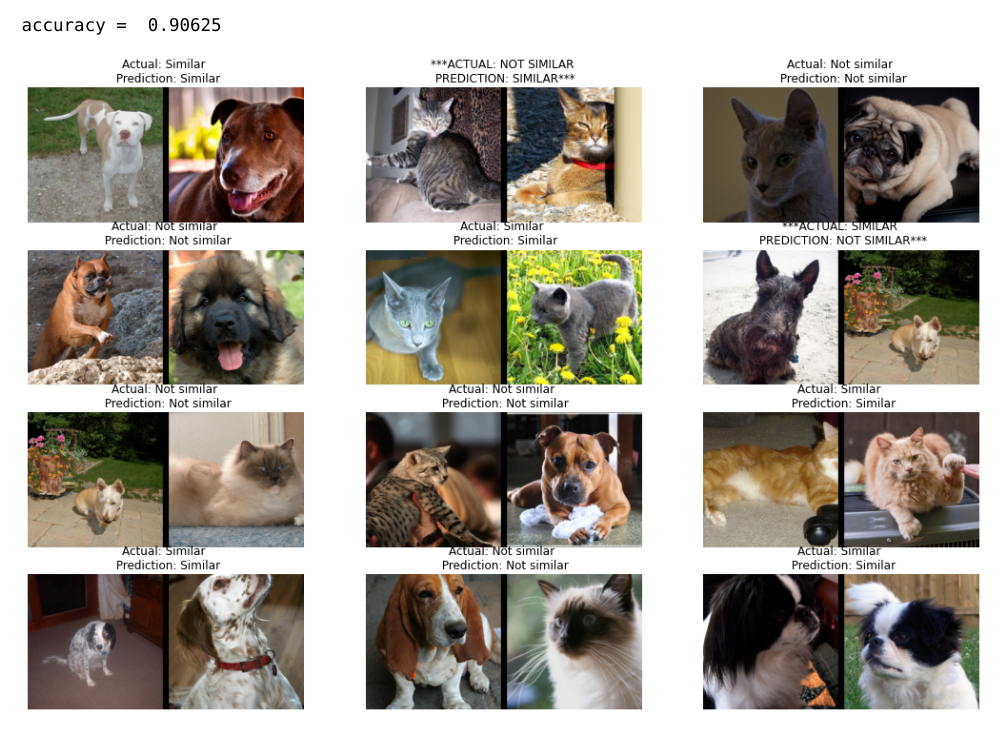
...the model achieved an accuracy of 88 to 90% in identifying pet breeds -- here's the kicker -- that it had never seen before. The model was trained on a completely different set of breeds, which would have stumped a traditional NN classifier, but the similarity-based embedding method was able to apply the "semantically meaningful" representations learned during training to group new pet breeds by similarity!
There's an important point / "confession" that needs to be made here: These "pet breeds" results were obtained using way more than 3 dimesions -- 128 dimenstions to be exact. In the real world, such high dimensions are typically necessary. In part 2, we'll explore more carefully how the dimensionality of the embedding can affect our accuracy.
Summary
The "Joy of 3D" referred to in this blog post is about 3D as a teaching tool to motivate our understanding of both traditional NN classification and contrastive-loss based metric learning as both being types of embeddings.
The types of "triangle plots" introduced here give students a visual interpretation of "where the data points are" in terms of...
- prediction/probability values (via locations of dots)
- losses (~ distance from target)
- accuracies (which side of "the line" they're on).
- Thus it also gives you a visual representation of the "confusion matrix".
- You can inspect the data points by mousing over the dots to see the images.
- Thus it allows you to track "top losses" visually, i.e. points that are "not where they're supposed to be".
Next time, I'll walk you through the specifics and show you some actual training examples (that you can run on your own).
P.S.- If you don't want to wait for Part 2 to be properly written up, you can "skip ahead" and check out my rough code on Colab implementing my fastai callback VizPreds that explores real training examples with these sorts of "triangle plots."
Acknowledgements:
Special thanks to Zach Mueller, Tanishq Abraham and Isaac Flath for assistance in interfacing with fastai!
References:
- "Siamese and triplet learning with online pair/triplet mining" by Adam Bielski
- Example of new `Pipeline` class to create data for a Siamese model," by Jeremy Howard
- "Siamese Network & Triplet Loss" by Rohith Gandhi
- pytorch-metric-learning by Kevin Musgrave
- "Contrastive Loss Explained" by Brian Williams
- "Bootstrap Your Own Latent (BYOL)" by Grill et al
- "Siamese Neural Networks for One-shot Image Recognition" by Koch et al
- "Few Shot Learning" by msiam
- "Learning to learn, Low shot learning" by Katerina Fragkiadaki
- "Embarassingly Simple": "We describe a zero-shot learning approach that can be implemented in just one line of code, yet it is able to outperform state of the art approaches on standard datasets"